test
Author Archives: 11l13
image.jpeg

old one of me made right before the ‘basic’ stage, though that Ann chainmail top I would wear from time to time no matter what
p/s started to give away my clothes & not interested anymore in buying more designer stuff
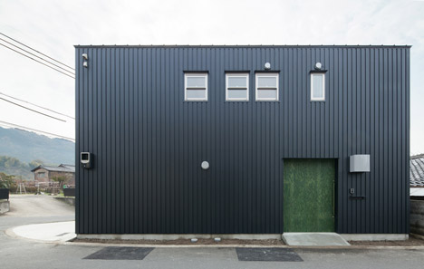
Ideal house

Danchi hutch by Japanese architect Yoshihiro Yamamoto. Simplicity, simplicity…


the Nothingness
Recently I feel like I’m finally tired of everything ‘designers’, I mean, in quite a broad sense of word. For work, I have to look at a lot of ‘new’ stuff that comes every few month from different fashion brands as well as countless examples of ‘new’ furniture of interior designs, but I found very few of it to be really exciting. It’s not like I pretend to be a spoiled critic of everything, I’m rather an overwhelmed observer as I’m tired of things that supposed to ‘wow’ or ‘attract’, catch my attention or whatever.
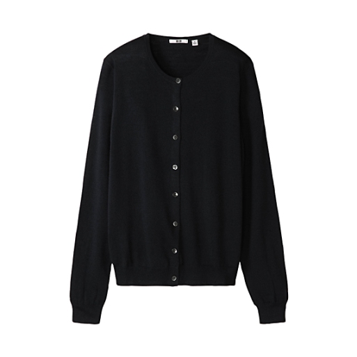
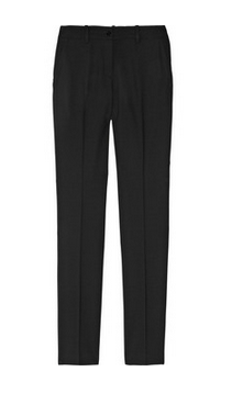
Now I choose everything that is blank and purely functional. It’s not minimalism or classic, but rather ‘blank-ness’, ‘basic-ness’ of appearance. It’s this point of no reference which were once so perfectly described by Gibson in his ‘Pattern recognition’ novel. For example today many fashion brands that considered to be minimalistic, like Celine or Calvin Klein, produce rather simple, ‘clean’ designs but always with a twist, be it a futuristic fabric or some ‘sharp’ detailing. After all this kind of design is very 2010s while the things that I’m talking about couldn’t be clearly identified with the specific period of time – as much as it’s not about past it’s neither about ‘present’ or ‘future’ but rather about timelessness. And honestly, with most brands producing about a minimum of 4 collections a year the concept of anything ‘new’ or ‘designer’ has clearly devaluated. There’s such a mess of gazillion collections per season, special editions, artist/designer collaborations, exhibitions, special videos that you just want to stay away from all this. I noticed that recently all my Jils and Balenciagas are sitting in my closet, while I’m wearing blue jeans and GAP tshirts.

Also, today, thanks to the Internet , much more people are aware about the fashion trends, brands and its collections etc. That’s why it seems to me that today people more and more are identified and judged by what they wear. Of course it’s been there long before the digital era etc. but it became worse than ever these days. There could be no logo but still most of the pieces are very recognizable. I mean that whatever you wear people will always try to put a label on you – no matter wether you’re sporting a must have from the recent major runway or some second-hand stuff – it will be a certain reference which will inform the way in which you’ll be perceived by others. It’s like there’s too much context to everything. Probably that’s why I feel urge to wear the most neutral things, the ones that won’t give any information about you so you’ll be perceived for what you are. Maybe this way the shift will be on a person, not clothes.
Talking about this those ‘basic’ things, probably the best way to describe what I’m talking about would be to say that it’s extremely neutral-looking things. The only quality by which they could be defined is that they couldn’t be defined. You couldn’t tell the brand or year it’s been produced, nor the price range. It’s just ‘things’ – a skirt, a chair, a bottle. Each thing being a sort of an arithmetical mean of it’s category. This kind of design requires an immense attention to details in order to keep this ‘anonymity’ – all the stitching, detailing, textures should be mere and rigorous.
On a side note – same feelings go for the interior&product design. For example recently I’ve been visiting a few restaurants and cafes all of which made a very good impression on me, but when I started to analyze what exactly did I like about them except the good food, one of the first things that came to mind was that all of them had very basic, neutral decor – white walls, simple wooden furniture, etc. There was no single ‘designer’ item in it or at least nothing that looked like it was ‘designer’, nothing to distract you from your meal and from your company.
p/s in this context it’s also interesting to remember a sort of a trend for tear off the labels from designer clothes which considered to be ‘cool’ in mid-00s though I always thought it to be a way to show-off.


sterling ruby exhibition in london, april 2013


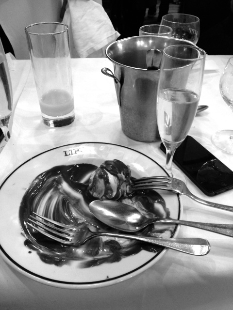
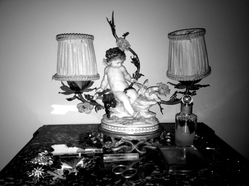
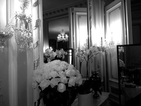
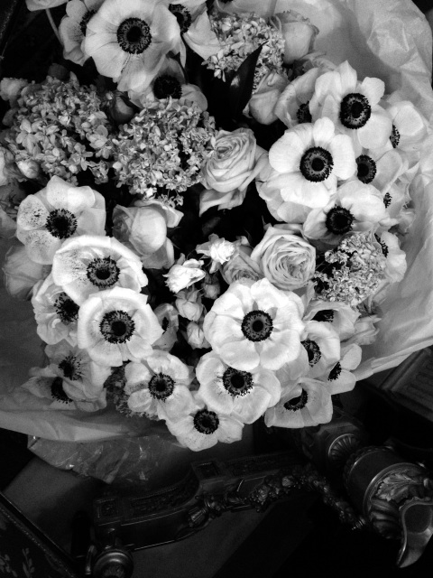
paris, jan’13 – all work and no play


Back to future
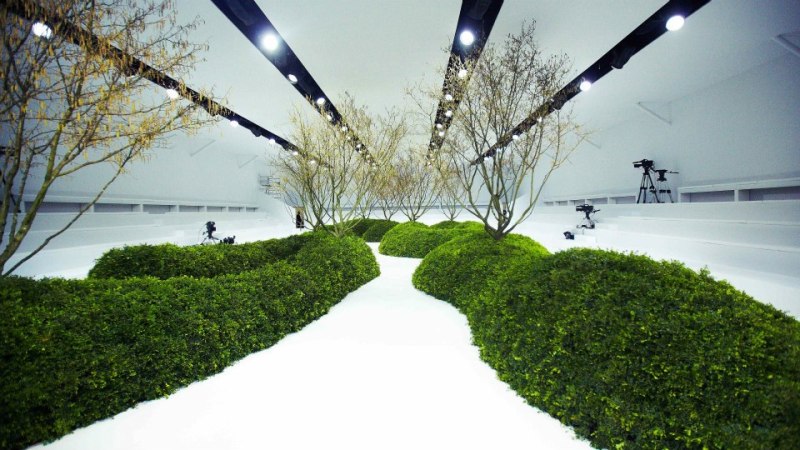
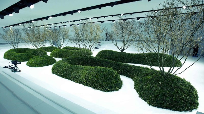
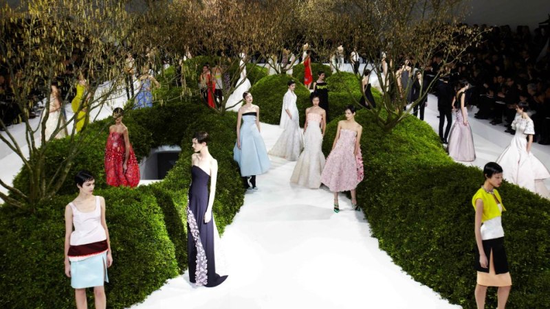
 The set for the new Dior couture show made by Bureau Betak – ‘mirror box’ pavilion with the grey sky and bare trees reflecting in it as if there’s no actual building. The interior for me looks like some relaxation garden at the 70s-designed spaceship. Spring in cyber-garden.
All pics by Bureau Betak.


Marina x Givenchy
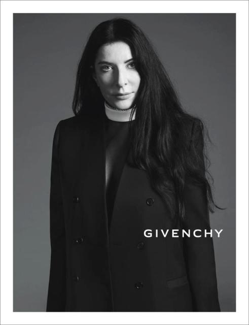
Marina Abramovic in the Givenchy ss13 ad
surely it was meant that Marina here is exploring elements of ritual and gesture while representing physical and mental purification at the same time addressing the political traditions of her past while testing the limits of the relationships between the performer and the audience – assigning the passive role to herself, with the public being the force which would act on her. let’s hope that this performance will raise the sales.

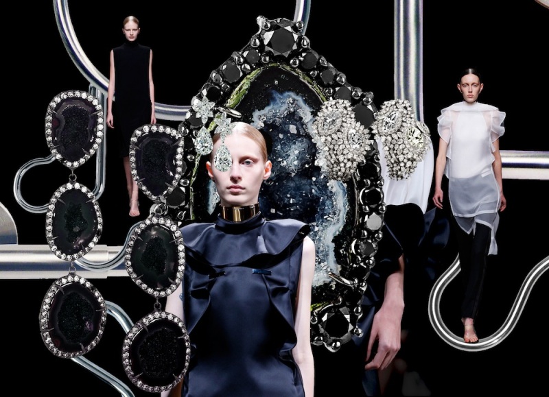
Black silk fringe on black velvet
The future is in reach
seems like soon we’ll be like a wizards – having everything working according to the smallest motions of our hands.
Weight of luxury
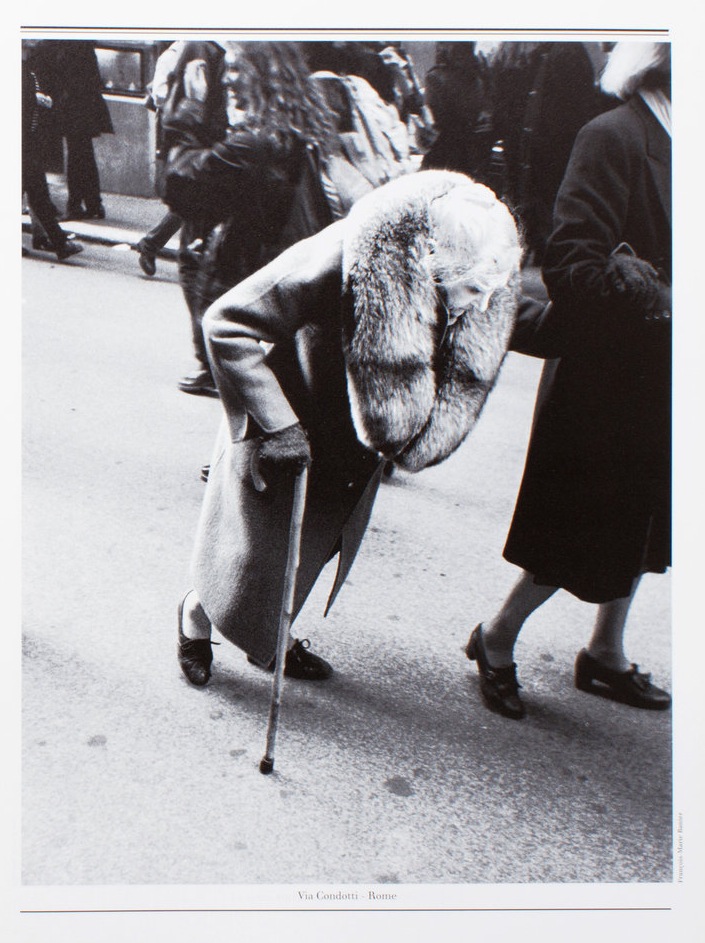
or maybe weight of time? anyway, can’t get this picture out of my head – it’s from Egoiste magazine and shot by Francois-Marie Banier.
Swan-like embrace

Sadly I can’t describe this photo by anything but a silly catch-phrase ‘pic of the week’ – it has everything I like – the grim colour palette, the art reference, the beautiful plastic of figures, expressivenes and simplicity at the same time. it’s Nan Goldin’s ‘Swan-like embrace’.
Painterly vs. linear
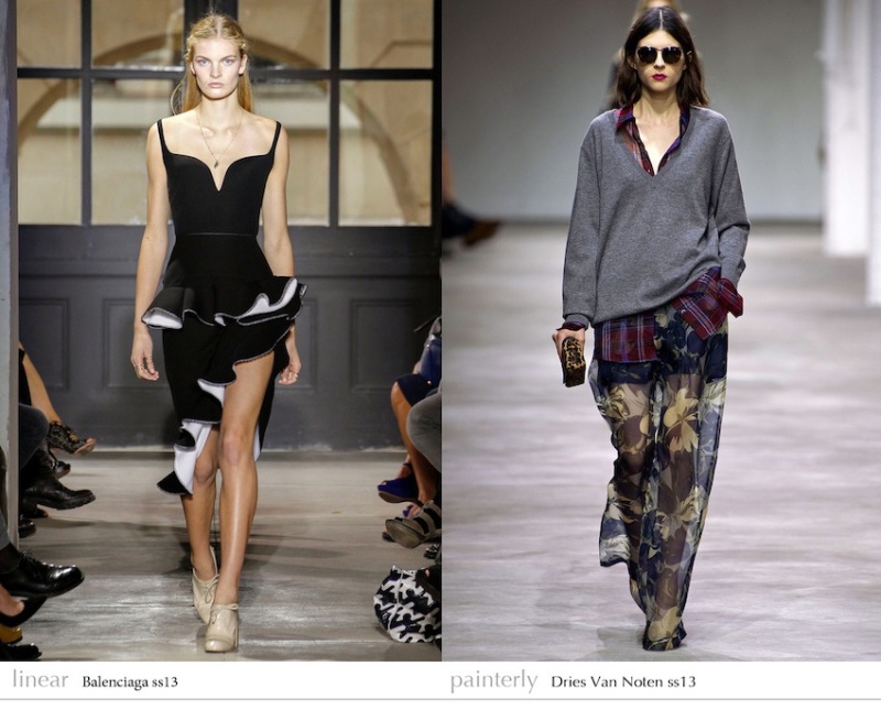
Somehow while uploading the pictures for my post with the CdG photographs I started to think about Wolfflin’s principles of analyzing of art described in his ‘Principles of Art History’. I mean this contradiction of painterly vs. linear, because for me the clothes on those photos look quite painterly (actually reminding me of Francis Bacon’s works). I tried to apply this concept to works of other designers as well. Thinking about it I found Dries van Noten, Lanvin, Rodarte, Vivien Westwood to be the painterly ones, while Givenchy, Jil Sander and Prada seems to be the examples of the ‘linear’ ones. Though sometimes it’s quite difficult to decide, for instance among Hussein Chalayan’s work there are some which are more graphical and ‘clean’ and the others where there are a beautifully chaotic mash up of textures, colors and volumes.
I remember that while reading Wolfflin the most interesting parts for me were the ones where the concept of ‘painterly vs. linear’ was described with examples from sculpture and architecture which for me speaks about the versatility of the concept.
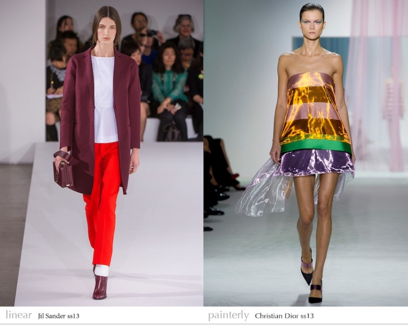
In case of fashion I think that the ‘painterly’ designers in general are the ones who work more with volume, cut and textures, while the ‘linear’ are obviously so-called minimalists, designers whose works might be described as ‘structural’ and brands specializing in prints and patterns. Though sometimes ‘painterly’ and ‘linear’ elements could be combined in one outfit or in one collection. All in all I think it’s interesting to try to apply this concept to fashion and see the results. I also think that it could be interesting to put in this context the work of different stylists.
Also I’d say that for me painterly vs. linear concept is in some sense one of many incarnations of the chaos vs. order juxtaposition and it might be case of why it’s so universal.
With deep sorrow
I’m officially in mourning over the now confirmed appointment of Alexander Wang as the new creative director at Balenciaga – it’s such a mésalliance. In my opinion t-shirt designer whose collections look so alike that you couldn’t really tell apart one from another by no means could be the head of such influential and innovative brand. Surely he will now have the official right to ‘re-interpret’ (cough) anything that Ghesquiere did in the past. Good for him that there have to be the vast archives and a good team though we’ll see if this will be enough for him to fill in the shoes of Ghesquiere.
In the past few years many of the houses that ruled fashion in the last 15 (or so) years got new creative directors – Dior, McQueen, Valentino, Yves Saint Laurent, Hermes, Kenzo, Galliano and now Balenciaga. This is really the end of an era (and I do realize how cliché and pretentious does that sound). Hopefully we’ll see more of Ghesquiere’s work in future wether from his own label or from some established house that might hire him (I have my guess where he might end up).
Screen of the week

heil to the early 00s – sexuality and digitality – I feel that it’s been just enough time now and soon we’ll see lots of stuff inspired by it.

Pump up the volumes
 That famous Comme des Garçons ss97 collection. Photography Kishin Shinoyama, art-direction Tsuguya Inoue, Six magazine, 1997


Medieval tech

Quite paradoxically I’m equally fascinated by something medieval/antique and something technological/futuristic. As well as I like something visually very raw/chaotic/eclectic and something very minimalistic, even plain, to the point where there are no references at all, even the slightest. I wonder where’s the cross point.
Paradise lost

One of my favourite editorials ever. Just look at these exploding flowers, that shade of blue and Gemma Ward’s alien beauty. i-D october 2005, photography – Nick Knight, styling – Jonathan Kaye, model – Gemma Ward.


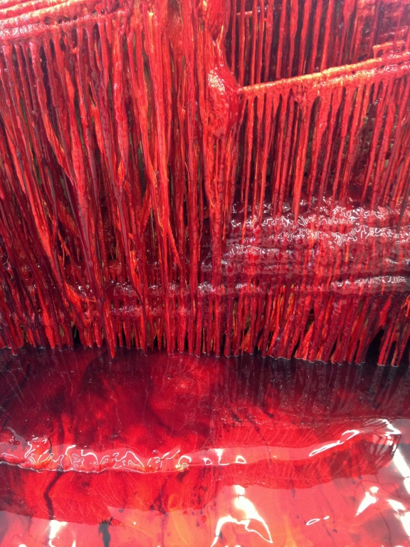
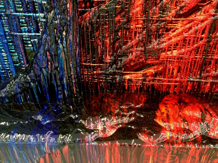
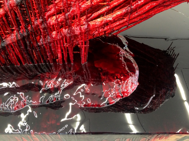
Red and black

Shots taken at some botanical garden in Paris, guess it’s something like a piece of prehistoric wood that over the years changed it’s structure to almost marble-like.

